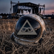
A cover is the first few seconds of a song before anyone presses play. The best album artwork ideas do more than catch a scrolling eye: they give the listener a place to stand. A dim room, a flooded street, a face half-hidden by light, a symbol that feels familiar without being explained. For independent music, that visual invitation can turn a single release into the beginning of a world.
Artwork does not need to illustrate every lyric or announce its genre in block capitals. It needs to carry the emotional temperature of the record. A tense, nocturnal electronic track may need more shadow than spectacle. A warm, nostalgic release may live inside faded colour, worn paper, or the strange softness of an old photo. The right idea is rarely the busiest one.
Start with the feeling, not the format
Before choosing a camera, typeface or image source, name the feeling you want to leave behind. Not the broad genre label, but the private weather of the music. Is this release a late-night drive with nowhere to go? A memory becoming unreliable? A moment of relief after a long period of noise?
Write three to five words that belong to the songs, then use them as a filter. If the record feels intimate, vast, unsettled, tender and metallic, an aggressively cheerful collage probably is not the answer. This small exercise prevents the common mistake of choosing artwork because it looks fashionable rather than because it belongs to the music.
A strong cover also works at thumbnail size. Streaming services reduce carefully made art to a tiny square beside hundreds of others. Keep one clear focal point, protect contrast, and check whether the image still holds its atmosphere on a mobile screen. Detail can reward a closer look, but the central feeling should arrive immediately.
12 best album artwork ideas for independent releases
1. A cinematic still with an unanswered question
Use a photograph that feels like a frame from a film nobody has seen. A figure at a bus stop, an empty car park under sodium light, a house with one lit window: these images suggest a story without forcing one. Leave room for listeners to place their own memories inside it.
2. A portrait that refuses perfection
A close portrait can be powerful when it is not polished into anonymity. Blur, grain, a turned head, rain on glass or harsh flash can make a face feel human and slightly elusive. This approach works especially well for songs built around confession, longing or emotional friction.
3. An object made into a relic
Choose one ordinary object with a personal charge: a key, cassette, wilted flower, broken mirror, burnt-out globe or handwritten note. Photograph it with care and let it become a relic from the release’s inner world. The trade-off is clarity – the object should feel deliberate, not random.
4. A landscape altered by colour
A familiar landscape becomes uncanny with an unexpected colour treatment. Try deep red skies, blue-black trees, washed-out daylight or the sickly green cast of fluorescent light. Avoid adding effects merely for drama; the altered palette should echo the production and the mood of the vocal.
5. A hand-built collage
Scanned paper, torn photographs, old book pages, paint, tape and handwritten fragments create a tactile alternative to overly clean digital work. Collage suits music that moves through memory, fracture or layered sound. Let the rough edges remain visible. Imperfection is often the point.
6. A symbol with no fixed meaning
Create or photograph a recurring symbol that listeners can attach their own meaning to. It could be a geometric mark, a moth, a doorway, a clouded sun or a strange piece of architecture. Used across singles, videos and merch, it can become a quiet thread through the project without turning into a generic logo.
7. Type as the main image
Sometimes the title itself is the artwork. Choose a type treatment with character: distorted letters, imperfect handwriting, restrained serif type or text that seems to emerge from fog. This works best when the words are memorable and the typography has a clear emotional reason for existing.
8. A blurred movement study
Long exposure, camera shake and motion blur can turn a body, city light or natural scene into something almost abstract. It is a natural fit for electronic music with pulse and atmosphere. Keep enough form in the image that it feels intentional rather than like an accidental outtake.
9. An empty interior
Rooms hold stories even when nobody is in them. A motel corridor, bedroom, stairwell, lift, laundromat or abandoned office can feel intimate, lonely or quietly threatening. Look for one detail that breaks the silence – a tipped chair, a television glow, a curtain moving in an open window.
10. Nature seen at the wrong hour
Mist over scrubland, a shoreline before dawn, wet asphalt after rain or trees lit by a distant storm can carry a vast emotional weight. Natural imagery can become cliché when it is too pretty, so seek weather, texture and unease rather than postcard beauty. Let the landscape feel like a character, not decoration.
11. The distorted archive
Use an old family photo, a found slide, an outdated document or a childhood image, then alter it through scanning, cropping, overprinting or physical damage. This idea is strongest when the release genuinely touches memory or identity. Treat personal archives carefully; mystery is more compelling than forced nostalgia.
12. A world built from one impossible detail
Start with a believable scene, then introduce one detail that does not belong: a second moon, water flowing up a wall, a shadow facing the wrong way, a figure hovering just above the ground. That slight rupture can make artwork feel dreamlike without losing emotional gravity. It suits music where reality feels close, but never entirely stable.
Turn an idea into a cover that lasts
Once you have chosen a direction, make a small visual brief before the shoot or design session. Include the feeling words, a limited colour palette, reference textures, and one sentence about what must be visible at thumbnail size. This gives collaborators a shared language while leaving room for surprise.
Restraint matters. One strong photograph with thoughtful grading will usually outlast a cover crowded with effects, clip-art and too many typefaces. The same goes for titles and artist names. If the image already carries tension, you may only need quiet text. If the type carries the concept, the image can step back.
Think beyond the square, too. Album artwork has a longer life when it can extend into social posts, visualisers, lyric clips, physical inserts and release-linked merch. That does not mean every asset should be identical. A cover might use a single blue-lit doorway, while the wider campaign explores the room behind it, the symbol on the wall, or the lyric that belongs there.
For a project such as Most Epic Dream, where sound moves between atmosphere, emotional songwriting and cinematic scale, artwork can hold the threshold between those elements. It can be beautiful, but it should also feel lived in. A little strangeness gives the listener somewhere to return to.
Choose the image that still feels true when the release is no longer new. If it carries the same small ache, question or flash of light that made you write the music, it has already done more than decorate the cover.
Bringing a release together?
Most Epic Dream offers independent music production, mixing and mastering services for artists looking to turn an idea into a finished release.