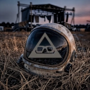
A song may begin with a breath, a drum machine pulse or a guitar held long enough to feel like weather. But often, the first contact happens in silence. That is why album artwork matters: before a listener knows the melody, they have already met the world around it.
For independent music, artwork is not decoration added at the end of a release. It is part of the emotional architecture. It gives a name, a face and a temperature to sounds that might otherwise vanish into an endless scroll of tiny squares.
Album artwork sets the emotional weather
Music is invisible. That is one of its strengths. A listener can bring their own memories, fears and private meanings to the same three-minute track. Yet a release still needs an entry point, especially when it arrives among thousands of others on streaming services, social feeds and recommendation playlists.
Artwork offers that threshold. A washed-out photograph can suggest distance or nostalgia. A hard flash against an empty room can make a song feel anxious before it starts. Deep shadows, strange symbols, a ruined landscape or an impossible colour palette can prepare the ear for something cinematic, abrasive, tender or unsettling.
This does not mean the image must explain the lyrics. In fact, literal artwork can sometimes make a release feel smaller. A song about grief does not need a photograph of someone crying. A song about escape does not need an open road. The better question is: what emotional space does this music leave behind? Artwork can live in that space, where the answer remains slightly out of reach.
For atmospheric indie electronic music, that ambiguity is often the point. The right image can hold longing and unease at the same time. It can feel familiar without being easy to name, like a place seen in a dream and remembered years later.
Why album artwork matters in a crowded feed
Most listeners encounter a release at a reduced size. A cover appears beside a track title on a mobile, inside a playlist, below a video thumbnail or as a fleeting post while someone scrolls between trains, meetings and late-night insomnia. The artwork has very little time to register.
That does not make visual identity less meaningful. It makes clarity more valuable. A strong cover does not need to shout. It needs a recognisable point of view. It should create enough curiosity that a person pauses, then enough atmosphere that they remember returning.
Memorability is not the same as brightness or complexity. A minimal image can work beautifully if its choices feel deliberate. Think of a single figure against a particular horizon, a repeated object, a severe block of colour, or type that feels inseparable from the release. The image becomes a visual shorthand for the music. Months later, someone may not recall every track name, but they remember the blue-black cover with the distant lights. That memory can lead them back.
There is a practical trade-off here. Fine detail, quiet type and subtle texture may look extraordinary on a vinyl sleeve, poster or large screen, but disappear in a small streaming thumbnail. This does not mean every cover should be loud or simplified beyond recognition. It means the composition should be tested at the size where most people will first see it. Mood needs to survive the reduction.
A cover turns separate tracks into a place
An album is more than a folder of songs. Even when the tracks were written across different months, in different rooms and through different versions of a life, the release can become a single emotional place. Artwork helps make that possible.
It gives the listener a scene to inhabit while the music moves. This is especially powerful when a record travels through contrasting territory: intimate vocals beside enormous synths, distorted guitars after a fragile piano phrase, beats that fracture into ambient space. The visual can act as a quiet thread between those shifts.
A cohesive visual world also gives the artist room to continue the story. A single cover can inform video treatments, lyric visuals, social imagery, release announcements, posters and limited pieces of merch. This is not about forcing every image to match perfectly. Repetition without imagination becomes branding for its own sake. It is about returning to the same emotional language: the same light, symbol, texture, tension or sense of place.
When that language is honest, the music feels more inhabitable. A listener is not simply hearing a track. They are stepping into a world with its own weather and gravity.
The best artwork leaves room for the listener
There is a temptation to make a cover carry every idea at once. It must tell the story, show the artist, include the title, establish the genre, look good in a feed and make a striking shirt. Usually, that pressure produces an image that explains too much and feels too little.
A lasting cover often leaves a door open. It offers a mood rather than a full answer. Listeners can attach their own late drives, old houses, failed conversations and moments of change to it. The artwork becomes personal without pretending to be universal.
That openness matters for music with emotional weight. People do not return to a record merely because its concept was clear. They return because something within it made room for them.
Artwork builds trust before the first note
Visual quality cannot rescue a weak song, and a powerful song can still find its audience with almost no visual support. But when the music and artwork genuinely belong together, the connection creates trust.
The listener senses care. Not polish in the corporate sense, but intention. The cover says someone considered how this release should enter the world. That matters for independent artists, whose work is often heard without the large campaigns, familiar faces or industry machinery behind major releases.
Trust does not require expensive photography or elaborate design. A cheap-looking image is not necessarily an honest one, and an expensive-looking image is not necessarily a meaningful one. The question is whether the visual choice has a reason to exist. A grainy phone photograph might be exactly right for a fragile, immediate song. A carefully built digital landscape might suit a widescreen electronic piece. It depends on the music, the resources and the truth of the project.
Consistency matters too, but it should not become a cage. An artist can evolve from one release to the next while retaining a recognisable sensitivity. The thread may be emotional rather than visual: a taste for the uncanny, a recurring use of empty space, a feeling of human warmth inside synthetic sound.
From screen image to something you can keep
Artwork changes when it leaves the screen. On a record sleeve, shirt, print or small run of physical merch, it becomes part of someone’s daily environment. A listener may wear it, frame it, place it on a shelf or see it folded over a chair. The release continues to exist after the headphones come off.
That is why merch works best when it grows from the music itself. A symbol, lyric fragment or image with genuine emotional charge can become an object people want to keep close. A generic logo can identify an artist, but it rarely carries the feeling of a particular record.
There are limits. Not every album image needs to become a shirt, and not every striking visual translates well to fabric. Some artwork belongs on a square sleeve, where its detail and silence can breathe. Others become more powerful when cropped, enlarged or reduced to one icon. Let the material guide the decision rather than treating every release as a product range.
Make the visual choice as carefully as the sonic one
The strongest album artwork is not always the prettiest image in isolation. It is the image that feels inevitable once the music begins. It can make the first play feel like entering a room already charged with memory.
Before settling on a cover, live with it beside the music. View it small, view it large, and notice what changes. Ask whether it reveals too much, promises the wrong kind of record, or feels interchangeable with a hundred other releases. Then ask a simpler question: does this image make the music feel more like itself?
If it does, it has already done something rare. It has given invisible sound a place to land, and given the listener one more reason to return.
Step Into the World of Most Epic Dream
For Most Epic Dream, artwork is part of the music rather than something added after it. Each release builds its own visual world around indietronica, cinematic electronics, dark pop atmosphere and post-rock texture, giving the songs somewhere to exist beyond the speakers.
That relationship between sound and image runs throughout Polymorphic, an album built around contrast, transformation and music continually changing shape.